CueCam 2.0: Markdown-ish webcam presentations
YouTube - Watch this post's supporting video.
Before we start: What is CueCam Presenter?
CueCam Presenter is a Mac app that makes it easy to present rich content on your webcam.
You can show pictures, text, video, share your screen, a second camera and control other apps.
It’s a presentation editor where you create a sequence of “smart cue cards” to feed a teleprompter and display content as you speak.
It works seamlessly with Video Pencil to let you control your presentation and draw on your screen using your iPad.
What is Markdown?
If you’re not a programmer you might not know what Markdown is.
Markdown is a way to write formatted documents in plain text, that is, text that does not have extra information about fonts and colours. This is useful because you can describe a document’s structure and the meaning of its elements without deciding exactly how it will be displayed. It usually looks something like this.
# Welcome to CueCam 2.0 <- this is the title## It's great <- two hashes means 'secondary title'* This is a bullet point> This is a quote ~ by Someone
An app can take this code and decide that # Headings are in 36 pt Helvetica Bold or it could make those same headings stand out in a completely different way, for instance, by showing it in bright pink.
It’s easy for a human to read but it’s also easy for a computer to work with.
Stick with me and I’ll explain why this is relevant to CueCam 2.0.
What’s new in CueCam 2.0?
We have a brand new presentation editing interface.
After a fruitful Hacker News thread and conversations with my first paying customers I saw how the first version’s slide / teleprompter editor had a big problem: it wasn’t clear how to see what your audience would see.
CueCam 1.0
I’d added a hodge-podge of presentation features over time and they were all used in slightly different ways. It wasn’t clear how to preview your work and it was pretty inflexible.
CueCam 2.0 has a whole new presentation editor with realtime preview, a markdown-style syntax for building slides for experts and a new set of layout templates for newcomers.
I’ve revamped almost the entire user interface to make everything feel a lot more logical and self-explanatory. At least compared to 1.0!
CueCam 2.0
Slide Layouts
Live Camera / Dashboard
Clearer iOS Integration
More AI Text and Image Generation Features
I will talk more about the design changes later, but first I want to give you some background on the project.
Why I Made CueCam Presenter
Goals and Inspiration
My goal when creating CueCam Presenter was to make it easy to run presentations that go beyond a basic webcam, without getting bogged down in complex AV production software or running multiple interconnected apps just to be able to throw a title or picture on the screen.
I wanted to remove the friction of “can you see my screen” and the awkwardness of giving a Powerpoint presentation on Zoom.
I wanted to make audio a priority, so you could see at a glance whether you’re too loud or quiet, and make it easy to include the sound from a video or other app you might want to share.
I wanted to encompass some of the best practices and amazing ideas I’d seen for looking good on remote video (largely gleaned from Office Hours Global) without requiring all the expertise, configuration or a complex pre-flight checklist.
I wanted to make it easy to edit presentations that look as good as this. To start doing this, I had to find a way to separate content from presentation.
Content vs Presentation
Like any decent software developer, I always want to separate content from presentation.
Content, in this context, means the words, images, videos and any other cues that are required as part of a specific presentation.
Presentation, here, means how that content gets on screen (and into the virtual mic).
Software like OBS and Ecamm Live mixes your content with your presentation and that causes problems.
My OBS and Ecamm profiles were littered with scenes that I’d used in a single presentation but I was afraid to throw away in case I needed them at some unknown point in the future. A video, a title, a chart. I didn’t want my AV software to be an awkward mix of content and camera configuration. And I wanted to make the content portable. I wanted document bundles that could be passed from colleague to colleague instead of a link to some assets and some instructions on how to use them (instructions that nobody has time to figure out).
I wanted to be able to throw up a graphic or a video or a title or some bullet points without disappearing into a tiny thumbnail and I wanted to be able to edit these without having to grab my mouse and start dragging and dropping and right-clicking and rearranging text boxes or choosing font sizes.
I wanted to plan loose talking points, or the exact words I wanted to say, so I could speak confidently without losing my thread. I wanted to be able to focus on writing.
I wanted you to be able to draw on your screen, using your iPad and Video Pencil, without watching a configuration tutorial or relying on the opaquely implemented and awkwardly licensed NDI SDK, without any weird ghosting or video feedback.
I wanted to use my iPhone as a webcam and control all my camera settings directly from CueCam. I didn’t see any reason this needed to be complicated to set up.
And I wanted a teleprompter. I wanted to see my notes without looking away from my camera. I wanted to be able to see myself or whoever I was talking to, and for them to see me looking directly back. I wanted to see my carefully worded introduction. I wanted to see my interview questions. I wanted one window to drag into my teleprompter that showed me everything I needed to know, including a nice red border if my audio clipped.
I wanted one button to press. I didn’t want to have to remember a load of keyboard shortcuts or set up a load of Stream Deck buttons. I just wanted to run through a card and then press “next” without having to stop and think about which button is “next”.
">This was the best I could do on OBS!And I wanted to be able to travel. I wanted to be able to run decently-produced live streams from an AirBnb, using just my Mac, iPhone and iPad. (And a lav mic, and some headphones).
">Here’s how that looks (youtube).And I really wanted to be able to show stuff on my computer. And not just a silent desktop. I wanted to be able to bring up my music production software in one click and let you hear it. I wanted to be able to jump into a weird art piece I’d made with a game engine. I wanted to be able to do this without stress, and without breaking my stride.
This took a lot of tech.
CueCam Presenter goes pretty deep across a lot of different tech - audio, video, gpu-accelerated graphics, shaders, bespoke cross-device networking, parallel development of two iOS apps and integration with other Mac apps and protocols.
October 2023 - The launch of CueCam 1.0
I was moving to a new city. I had a baby coming. I tried to meet these deadlines to launch the app. After 20+ years as a professional software developer I’m usually pretty good at knowing how long something will take, but this app never stopped subverting my expectations.
It was so big that perfectionism wasn’t an option. And I had so many ideas for tweaks and improvements and new features that it was hard to stop. One Saturday I added music playback. And then spent the next week ironing out all the kinks. It should have been a post-launch feature but I couldn’t help myself.
There was a lot of tension between the requirements of a minimum viable product and something that did all the things I wanted for my weekly live streams.
After a few months of work it was time to put it in front of paying customers and get some real feedback.
Thankfully, I got exactly that. Some paying customers and a lot of feedback.
I should mention that at no point was I working in a silo. I knew there were people who wanted this app at every stage, having built a community around Shoot, Video Pencil, Beat Sheet and other (less successful) apps on Squares TV.
It wasn’t like previous big projects that went nowhere because I didn’t talk to anyone, I spent a lot of time talking to my customers.
But it did slow things down. I’d initially named the app “Beat Sheet Studio” and then a week before I was hoping to launch, someone asked me how wedded I was to that name. I groaned loudly as I realised I hadn’t really given it a lot of thought and now it was clear that it was not the right name. So I spent a week coming up with something better and then another week or two changing the name. Changing the name was not trivial and some early beta testers still have a problem with an unremovable camera extension as a result of this name change. And it annoys me every time I work on the website or CueCam source code that it’s still called “beatsheet” behind the scenes.
But the main thing was to get the most important features working and make sure that great results were at least achievable.
If you knew what to do with it. Despite the lack of documentation...
The problem of documentation
I’ve always found it difficult to create documentation.
This project helped me put my finger on exactly why.
As soon as you write down the steps involved in achieving a certain result with your app, it becomes clear that, with a small tweak here (or a large tweak there), at least one of those steps could be skipped.
So instead of writing a user guide or making videos that will soon (in my mind) be redundant, I spend a week making something easier to do. And then rarely do I write any documentation at all (because I’m worried that I’ll end up losing another week to yet another round of improvements if I try).
So I keep adding features and leaning on my weekly live streams, Discord server and release notes to let people know about them, which is particularly bad for people who are coming to the app for the first time.
Cycles of feedback
I like to get on video calls with my users, and started doing this more after CueCam 1.0 was released.
But each call resulted in a cycle of usability improvements and feature additions similar to those generated by my attempts to write documentation.
It’s great that the app is getting better and I’m getting a better idea of how to explain things to my users, but it can feel like wading through treacle sometimes.
I wish I could just say “here’s how to do X” without saying “but I want to make it work like Y which would be super cool”. If I conceive of an easier way something could be made possible, I feel guilty about giving people a more difficult way to do it!
Hacker News
I was a little scared, knowing the level of potential technical scrutiny to which I was exposing myself, when I finally posted my work to “Show HN” about 3 months after the initial soft launch.
People could see the value in the project and started trying it out. They gave me some great ideas, and I’ve already implemented a few of them.
I knew that putting screen shares over the webcam feed could compromise legibility so the suggestion of providing a mirror for windowing as a “desktop” made a lot of sense. Sometimes you do want to take over the call, and with CueCam you can now do it without your face disappearing into a tiny thumbnail.
I had the suggestion of attaching Video Pencil drawings per-slide which turned out to be trivial to implement and is incredibly useful.
As more people discussed my app through the framing of “presentation software” some design flaws came into focus for me. It’s called CueCam Presenter but in my mind it’s still the bastard lovechild of Beat Sheet and Video Pencil Camera, neither of which are remotely comparable to Keynote or Powerpoint.
A more familiar editor
A new approach
I decided that it was high time for CueCam to transcend its Beat Sheet roots and start resembling traditional presentation software like Keynote.
I started fiddling about with a large document preview and edit-in-place text boxes.
It was awkward to get it working properly but something else was making me uncomfortable. I never wanted CueCam to be like Powerpoint, full of RSI-inducing, misaligned text boxes. There was a reason that the existing version used a dash of Markdown-style syntax instead of turning everything into a form field.
I looked at other apps like Prezi and mmmhmm, next to more developer-oriented Markdown-based presentation tools. (On this live stream).
I noticed that I was falling between two stools - a code-based approach benefits from syntax highlighting and live previews. A WYSIWYG solution will show you what you’re getting in-place.
I wasn’t really doing either and this made things very confusing, especially when you teleprompter came into play.
I tried separating the concept of “cue card’ and “presentation slide” and ran into a problem that is very familiar to programmers.
I wanted my slide content to appear in my teleprompter in the same way as my speaker notes, but if I separated the two then I’d have to enter a lot of things twice.
That’s when I realised that I should fully commit to the code-style script editor instead of trying to introduce direct edit-in-place WYSIWYG-style features.
Key to the success of this approach would be the use of syntax highlighting and a live preview.
I put a prototype in front of my non-technical partner and she understood immediately, giving me the confidence to go full speed ahead.
TV Programming?
John Duhring got me thinking about the word “program”.
A TV show is a program.
We can program a computer.
So it makes perfect sense that lessons from one domain would apply to the other.
The same with script writing - it’s another kind of program with a syntax of its own, and if you’ve used a tool like Final Draft then you’ll be familiar with the specific syntax of a Hollywood script.
As a computer programmer I would never work without syntax highlighting and live previews, so why would I inflict this on my non-technical app users?
This is what CueCam new editor aims to provide. A focus on writing and absolute clarity about what will appear in the teleprompter and what will be seen by the audience.
Text is hard!
Building a good text editor is not easy. I certainly wasn’t going to reinvent the wheel, but I did want to use the best frameworks Apple has to offer. TextKit 2 is Apple’s recently-introduced reimagining of decades-old infrastructure. Unfortunately it is under-documented and, while powerful in isolation (giving you full control over all aspects of text layout in a way that supports any writing system you could name) falls into Sherlock Holmes territory when you try to figure out what is going on inside an NSTextView.
NSTextView is Apple’s “text editor” component. It uses TextKit 2 but also supports TextKit 1 and it can be switched to the legacy implementation automatically at runtime if the developer is not careful. I wanted Apple to do the heavy lifting of managing keyboard input, focus, selection, undo, etc... etc... and just add a sprinkle of syntax highlighting into the mix. I wanted to embed SwiftUI controls into the flow of text.
I was grateful for Marcin Krzyzanowski’s work on STTextView as he took on a lot of the painful reverse engineering required to figure out the framework so I didn’t have to.
I got my solution to do most of what I wanted, but at a certain point, the lack of source code access became a seemingly insurmountable problem so I had to make a couple of compromises.
It’s weird the things you end up having to do yourself. 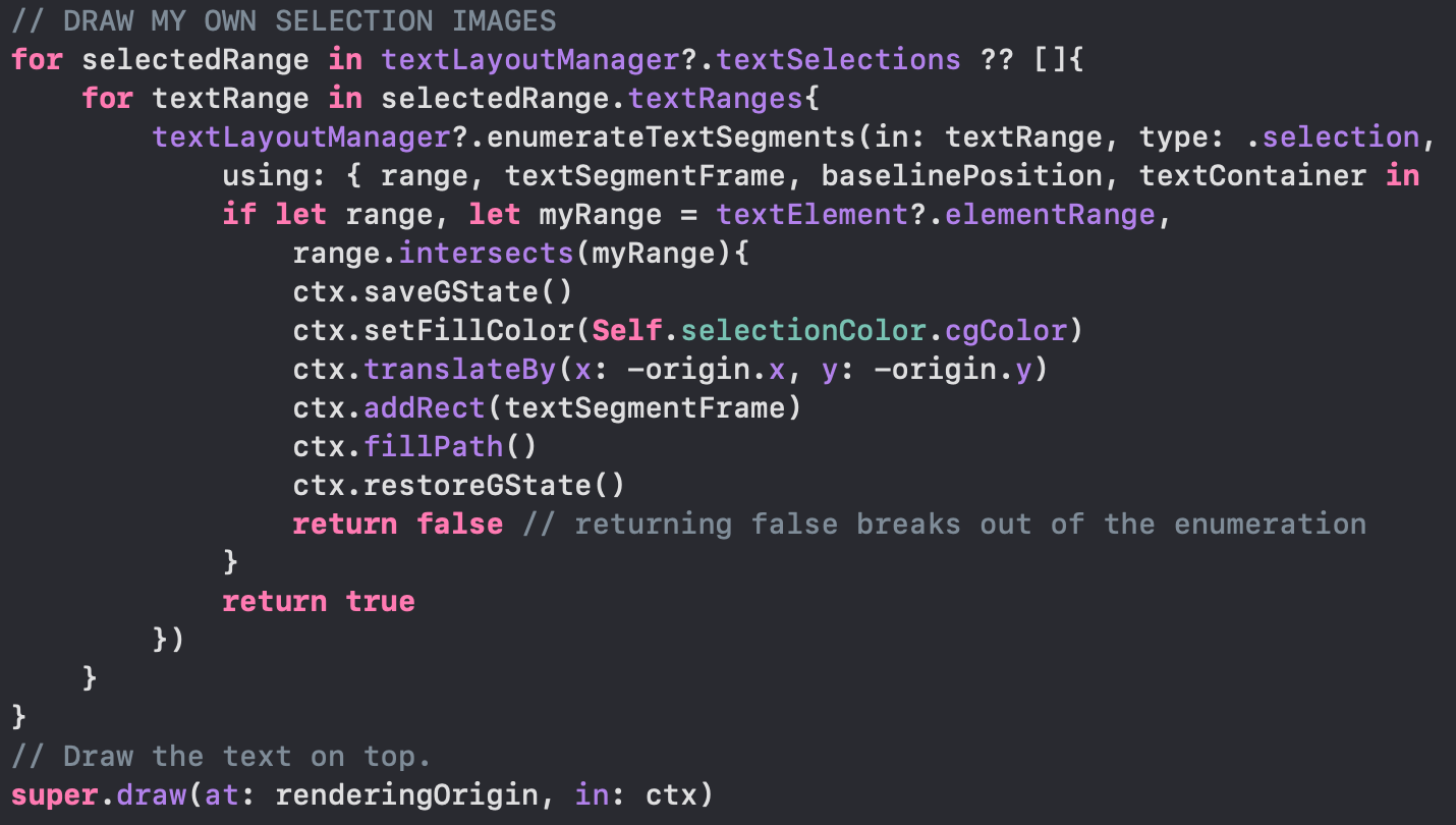
I have to draw my own text selection highlight?!
Deviating from Markdown
Initially I approached this as a code editor with a full Markdown parser under the hood. Fine, good, don’t reinvent the wheel.
But while that’s fine for things like # titles , * bullets and > block quotes , it starts to feel very fussy when you get into  and [^1]: Footnotes .
I watched somebody’s confusion when they deleted a whitespace character and their title disappeared - stuff that is second-nature to me as a programmer but feels annoying to anyone who is not!
I elected to take inspiration from Markdown but created my own minimal syntax.
Clear text goes into the teleprompter. Other things turn into slide content.# Headings are big## Secondary headings### "Paragraph text"! Image.jpg* Bullet Point> Quotation ~ Attribution^ Footnote// Comment text (doesn't appear in teleprompter or slides)
Retaining the cue card concept
In some ways it would have saved me a lot of headaches if I’d made a whole CueCam script a single text view instead of breaking it up into multiple cards. (It would have been a life saver in terms of smooth scrolling alone).
But the cue card metaphor is too useful! The single button “next” navigation is facilitated by dividing a script into discrete elements. Things become difficult if we have to scroll the teleprompter. When do we change slides? How is the scroll controlled? Continuous scrolling would require a separate interaction with a mouse or trackpad. Or you’d set it at a constant speed which would prevent mixing cards containing verbatim phrasing and other cards with looser notes. Speech recognition based scrolling would have a similar problem. I don’t want to have to type precisely every word I’m planning to say, every time, so then I’d need to put a lot of time into the fuzzy logic needed to make this feel natural.
The card metaphor offers itself to alternative use cases like video sequencing (subscribers to the CueCam YouTube channel will know that John Duhring loves this!). We can drag in a few video clips and navigate between them, or bring in B-roll or special reports and wait for them to finish. Triggers can be attached to cards and it is clear when they will fire. Cards can be dragged and dropped and selected, duplicated and deleted and everything makes sense.
So I figured out other ways to optimise some compromised scrolling performance instead of changing the entire mental model.
Slide Layouts
CueCam had a concept of “layout” that really meant “alignment” (left, right, centre, lower third, upper third).
I realised that I could solve a lot of confusion by introducing a proper “Slide Layout” dropdown to show how I recommend CueCam cards are used.
Now it’s easy to see what CueCam can do and start to build on sample content in the style of a more traditional presentation tool.
From 1.0 to 2.0 in 4 months?
Seems a bit soon, but my hand was forced...
CueCam’s document format contains a script with cards containing text and slides, each with a title, contentImage and backgroundImage. The slide content was, then, fairly restrictive.
The new editor offers much more flexibility, allowing arbitrary combinations of slide elements, almost entirely driven from the card’s text (background images and video attachments being the main exceptions).
This meant that the new editor required breaking changes, copying titles into the card text (so if you open a script in 1.0 and back in 2.0 you get duplicated titles).
It’s only been a few months but I don’t make the rules!
An aside on non-App Store distribution
I’ve been shipping apps in Apple’s App Store since iOS 2.0. For 15 years.
While I appreciate their motivation to limit spam on their platforms, Apple’s restrictions can often create extra legwork and inflexibility in certain areas.
I’ve found this most annoying when it comes to pricing.
If I go on a podcast or live stream I’m almost always asked if I can offer a discount to listeners. But Apple only lets me change the price for everyone at once. They offer specific mechanisms for certain types of discounts or trials on certain types of apps, but rarely do their offerings intersect with something I want to do.
Distributing CueCam outside the App Store gives me a whole lot more flexibility.
I can offer my own education discounts. I can make a deal with one customer to buy licenses in bulk. I can credit customers’ accounts based on their previous purchases of my other apps. I can make promo codes for specific audiences. I do this all through Stripe, and while it’s more work for me on the server, it lets me do a much better job of serving my users.
Thankfully Apple still allow us to legitimately distribute apps outside the App Store with notarisation giving users the reassurance that they are not installing anything too malicious.
The only thing I miss is the user ratings. I need to figure out how to handle ratings and reviews because at the moment it feels like you have to trust me more than you would if I were going through the App Store.
An opportunity for housekeeping
Calling this version 2.0 has been a great license to reorganise the app and put things in their logical homes.
I’ve created a new “Live Camera” option so you don’t have to create a blank script just to use the virtual camera.
I’ve consolidated audio, video and camera settings into one dashboard, available from scripts, the Live Camera mode and the Mac’s status bar.
I’ve brought Chat GPT features into the script editor so that you can get help on in-progress scripts, including generating images.
I’ve made the Shoot and Video Pencil integration more obvious by putting buttons in the main toolbar.
I’ve simplified side bars to bring new preview and selection mechanics.
I’ve been tweaking and refining and optimising and I think you’ll find the new version opens up a world of possibilities.
Most importantly:
I’ve been listening
Whether I’ve spoken to you face to face or read your comments on the internet, I’ve been listening. Every new person I put this in front of has a different perspective, but I’m finally honing in on something I think everyone can understand.
CueCam 2.0 is out now
You can download CueCam for free from cuecam-presenter.com. You don’t even need to sign in to use most of its features.
If you have feedback, I’d love to see you in the Discord where we have threads for issues and suggestions.
If you’d like a one-to-one demo or invite me onto your podcast or live stream, you can email me michael@squares.tv.
Thanks!